One of the requests we get a lot here is to make a résumé that has the same visual style of the company at which they’re applying. We did a Microsoft-themed résumé in 2012:
We did a Vulture-themed résumé in 2018:
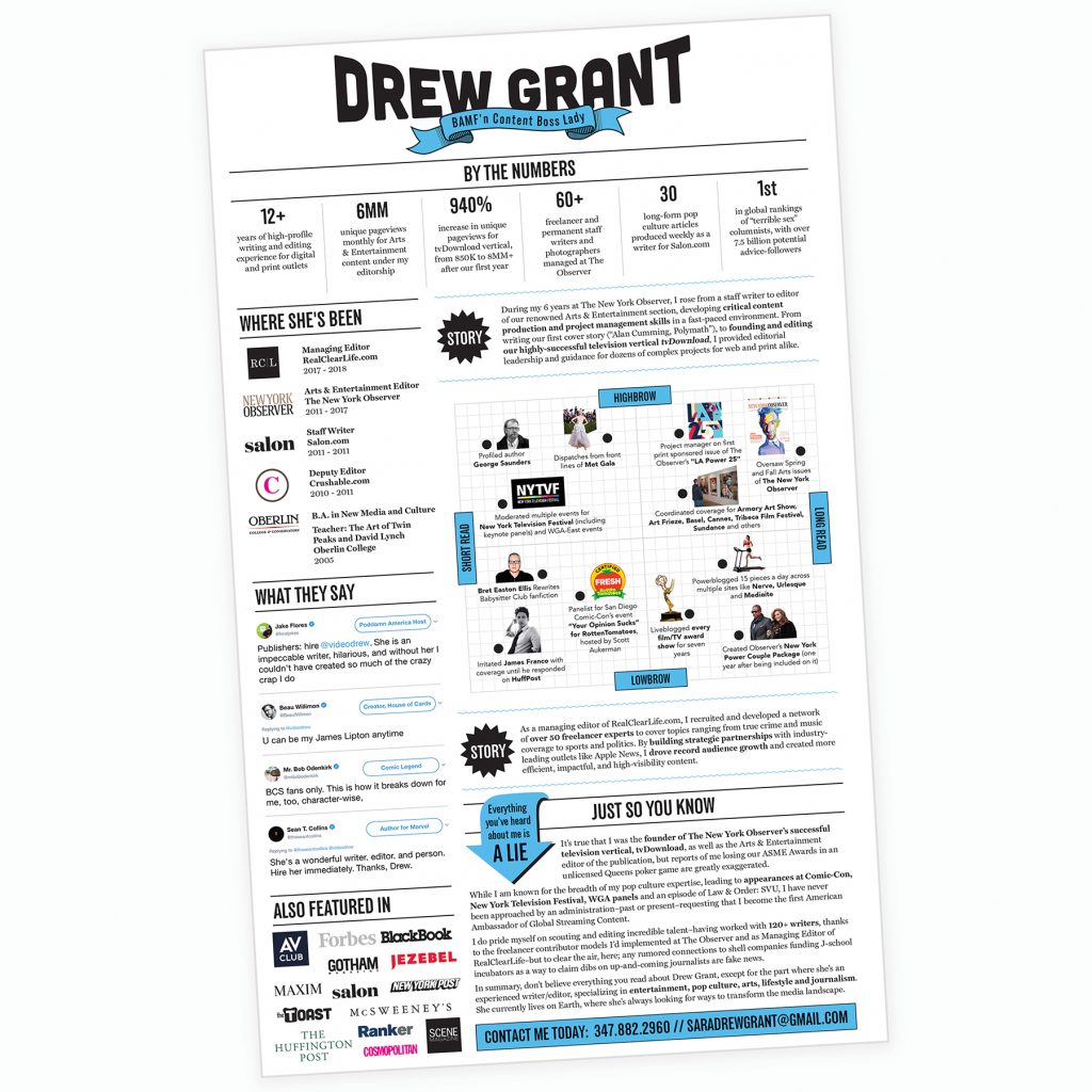
This one was especially fun because
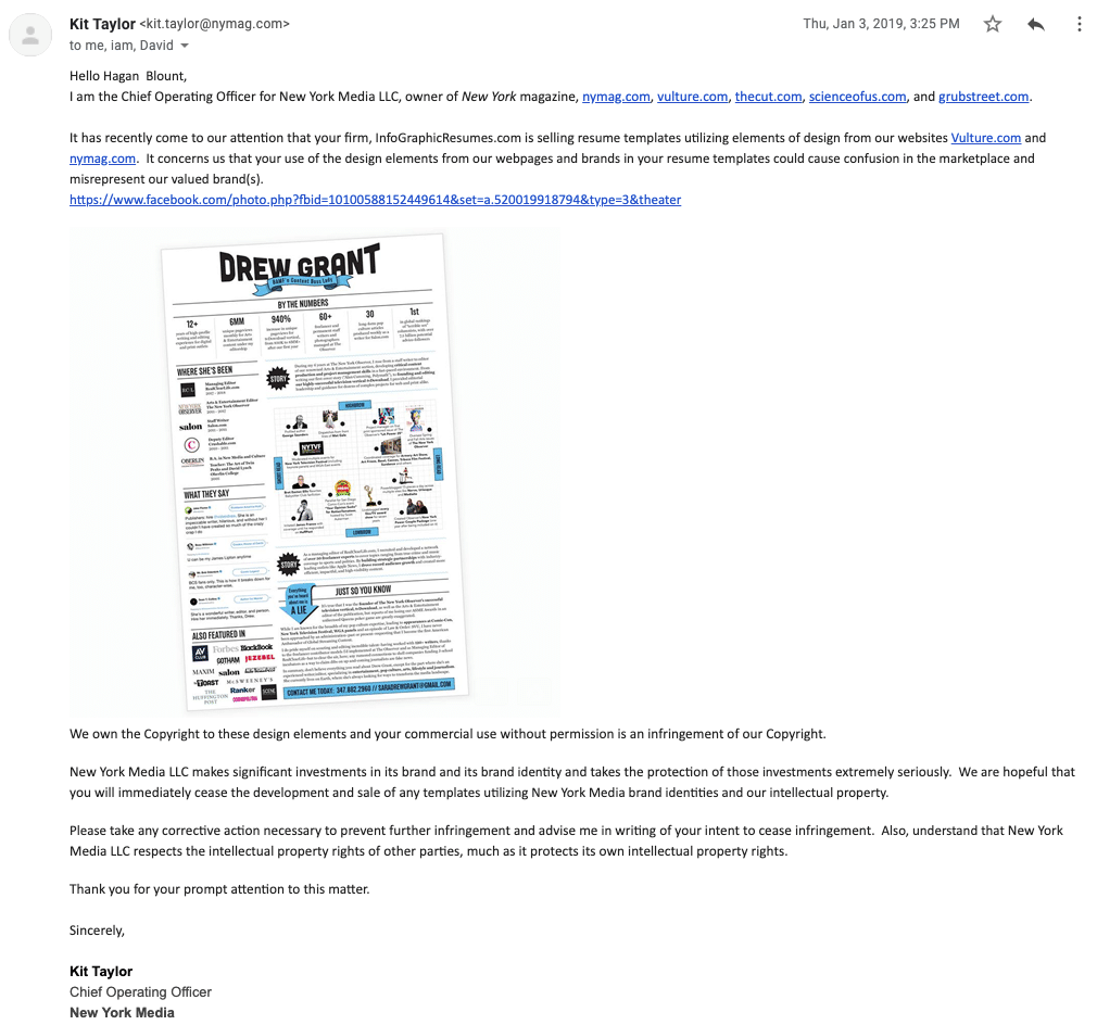
They sent us that because they thought we were selling it as a template (it was not – we’ve never sold another Vulture-themed résumé, in accordance with their request).
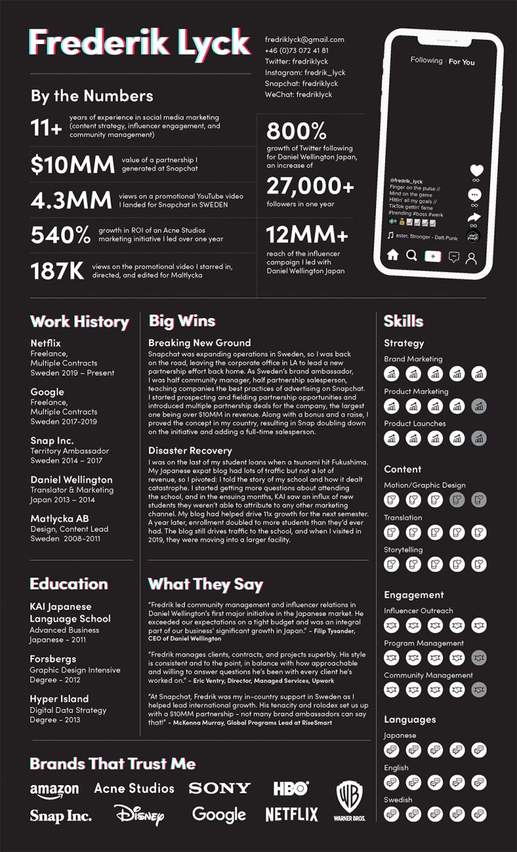
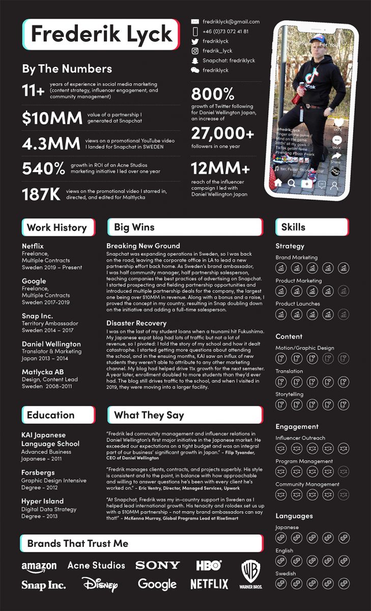
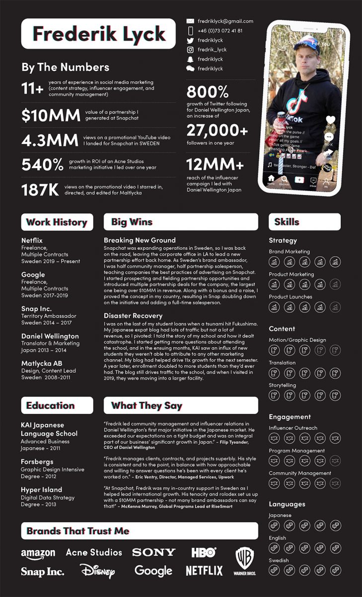
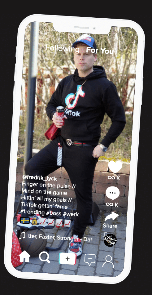
When Fredrik Lyck approached us about making him a résumé for a job at Tiktok in Sweden, we were excited. Fredrik had just worked with Snapchat doing almost exactly what TikTok was trying to do with the new position, so while the hiring process hasn’t played out yet, we think Fredrik is a shoo-in for this one because he shot the lights out at Snapchat.
So, how does someone make a Tiktok-themed résumé (or any company/brand/app-themed résumé for that matter)? One thing we don’t normally do is take you through the iterative process of creating a résumé, because along the way to glory there is a fair amount of disappointment and confusion. We usually don’t nail it the first time and some clients handle the design iteration roller-coaster better than others. FYI, the most basic service (the Infographic Résumé) you can get here doesn’t put clients through a lot of that. We wanted to start from the beginning and go through the steps we took to make this résumé awesome.
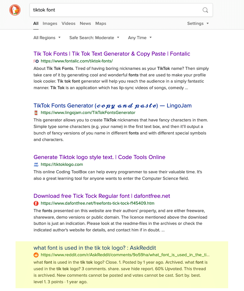
The first thing you need to do is to get the right fonts. Sometimes a quick Google search will help with that:
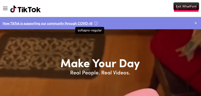
Sometimes we need to use an app. We use WhatTheFont – it works a few ways. One is a browser plugin that lets you hover over fonts on the page to find out which ones they are (not always perfect, but it worked this time):
You can also upload a screenshot and it will select the “glyphs” (characters) and it will figure it out for you:
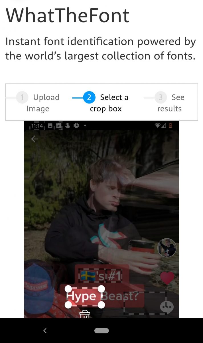
It’s not always 100% accurate in coming up with the right font every time; a lot of times they suggest a similar font first and the real one is buried halfway down the page. There were three fonts we needed here – two for the marketing and one for the app screen.
Then next thing we needed to do was to formulate the style for the résumé. Fredrik was excited about a black background, and since a lot of Tiktok’s UI is on a black background and not a lot of résumés are, that was going to be a clean, bold differentiator. We snooped around the Tiktok website and checked out their logo and their Jobs page and found these icons:
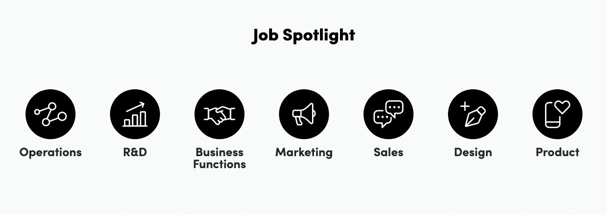
Here and the base of the app screen were the only places we could find any use of iconography. We can always create new icons in the same style, but you’re always hoping that whatever you can find is going to be all you need. We’ll see what happens.
The logo is a two-parter – an icon and stylized wordmark – clean:
We thought that we would repeat this treatment with the pink and teal throughout the headers. Fredrik also had the idea to put himself on the app on the résumé. We took all those ideas and here’s where the iterations started:
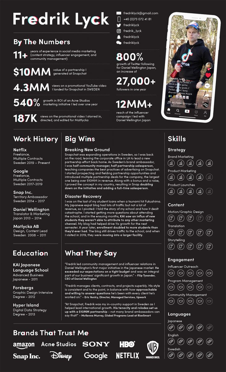
One obvious issue is that we misspelled Fredrik’s name. Hey, it happens.
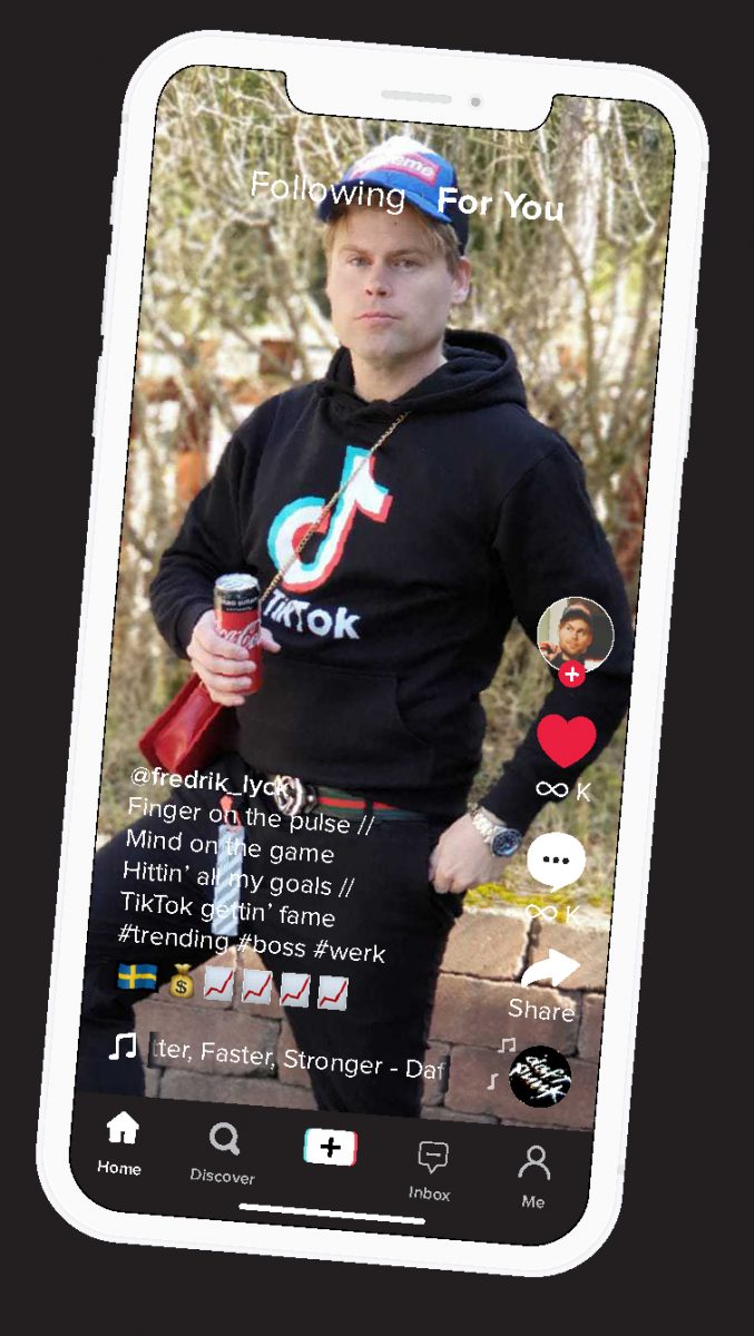
There were more issues, of course. If you refer back to the Tiktok logo, only the “o” has the stylized text treatment. On the résumé, the text treatment looks fine in the title (his name); the letters are large enough and spaced out. Unfortunately, it made it really hard to read the headers.
We did find some use for those icons – while they refer to different things on the careers page, they worked for what we used them for (categories highlighted):
In V2 we decided to see what it would look like if we scrapped the stylized text and instead stylized the entire header:
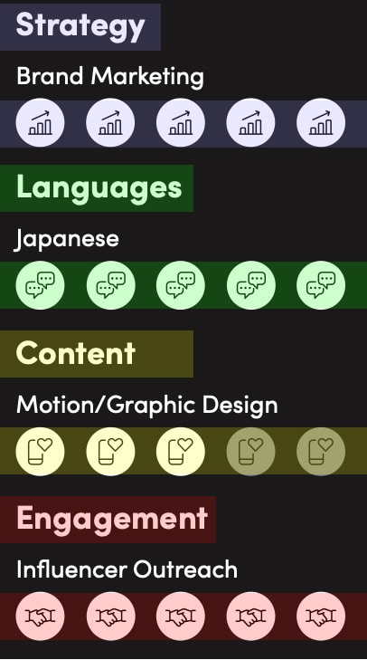
Not super excited about that. We scrapped that in the next iteration. We also switched out the verbiage indicating social channel handles in the contact section for icons and killed the icons in the skills section a bit. Skills sections where there are ratings are a little bit BS, but there’s something there if you explain why you used this format, we’ll explain later.
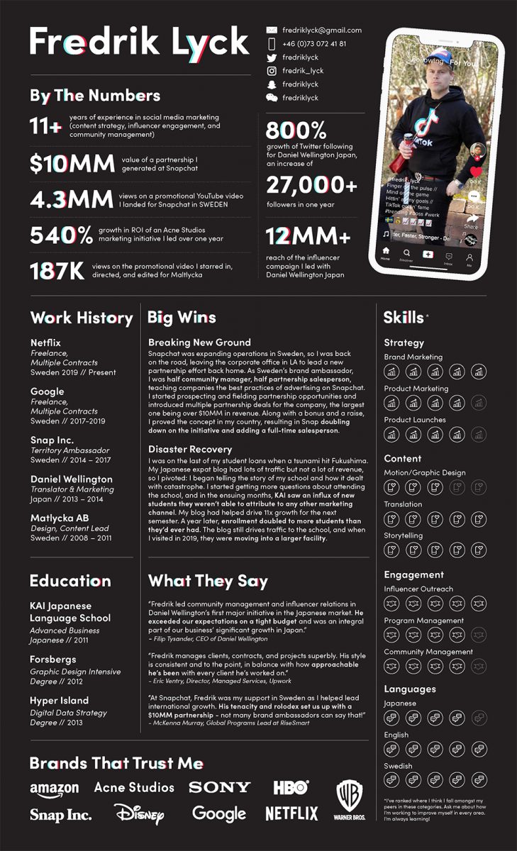
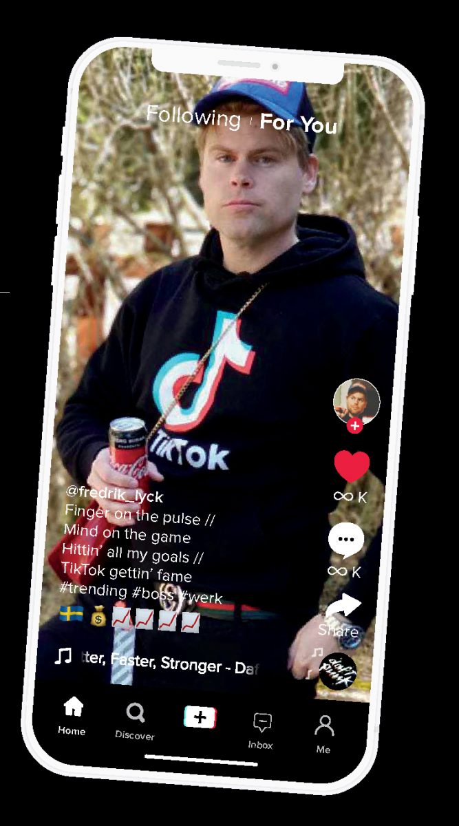
In V3 we’re still trying to figure out the headers:
Still ain’t it. Easier to read but the white background kills the blackness too much. In V4 we finally got it right:
In the logo, only one letter is stylized. We figured that would be the best way to do it – for the headers, our idea was to do one letter per word with the text treatment. Our theory here was that we’d:
We ditched the theory for the title because the “y” looked more dramatic than the “c.” See V5:
As I mentioned before, skills ratings are kinda BS but hiring managers like to know you have skills. A lot of times people don’t have something to graph that they’ve been tracking over time, so we know that a skills rating system is only as good as how modest the applicant is, but the world isn’t going to toot your horn, so there’s a balance. One thing we add is an explanation. Usually we say something like “this is how I feel I rank among my peers…” and if the candidate is doing any continuing education or on-the-job training, we’ll say something like we did here, “ask me about how I’m improving on these skills.”
I’m just going to jump straight to the final here since V6, V7, and V8 were focused on touch-up of minor issues to get everything accurate, aligned, spell-checked and proofread…
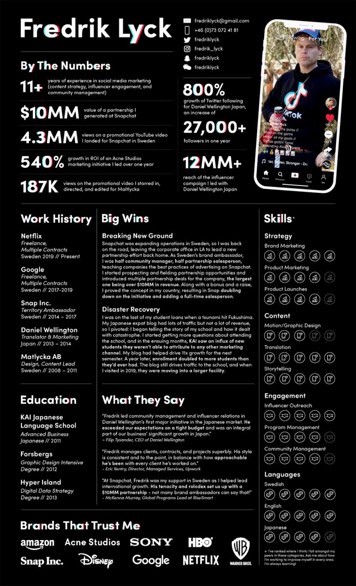
and perfecting the app screen. We needed to get it true to the actual screen, not settling for just-kinda-looks-like-the-Tiktok-UI. We started with just a layout:
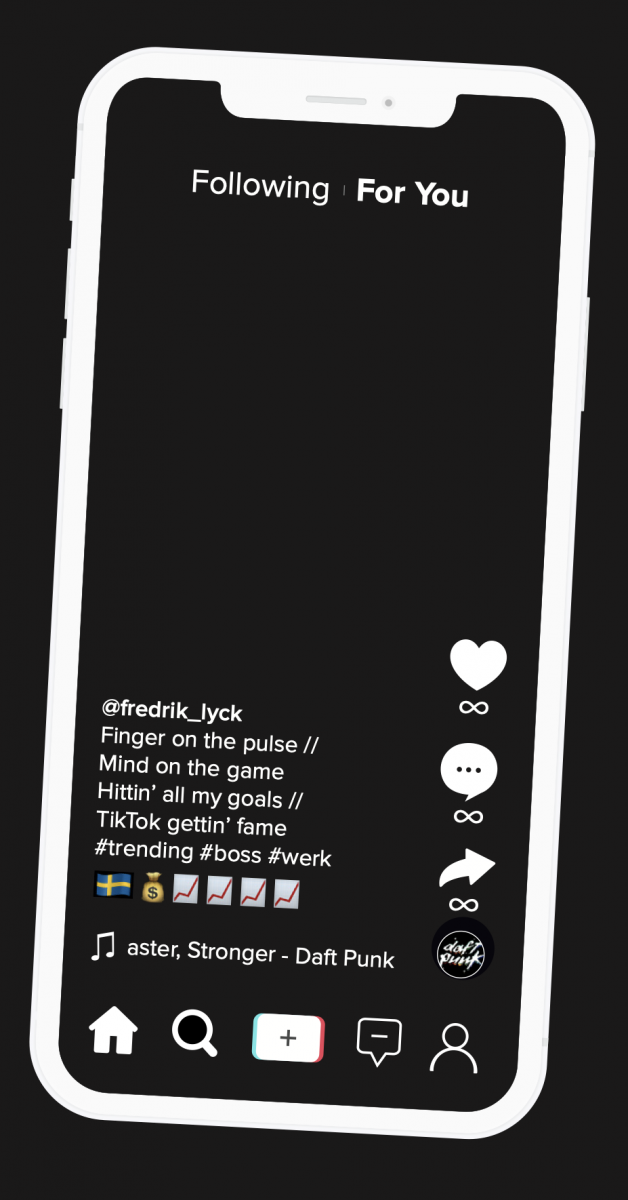
In V2, we added the image (shot specifically for this use) and made the record in the bottom right corner “spin:”
In V4 we changed the screen from the Android version to the iPhone version, illuminated the heart (to show that whoever was watching this video had already loved it) and added the dashboard button (above the heart – Fredrik’s profile photo):
In V5 we replicated the song title/artist area more accurately:
Finally, we made the screen border ratio more accurately reflect the iPhone’s dimensions, played with the photo sizing, and fixed the black box around the Swedish flag:
Aside from the infinite likes and comments, this one is exactly the app’s current look for iPhone. Someone will be Googling “Tiktok app screen” in 2031, find these and for the record we will not have steered that intrepid searcher wrong.
Now it’s up to Fredrik. He’s got the résumé and the cover letter out to Tiktok and he’s certainly got the résumé for it, We’ll keep you posted on what happens.
If you’re looking for that dream job at the dream company and you need a dream résumé, I gotchu fam. Holla atcha boy Hagan.
One Love,
Hagan Blount
Founder, InfographicResumes.com
P.S. These are a bit more pricey than the standard Infographic Résumé Package but a lot cheaper than the Personal Branding Overhaul. Prices will vary depending on the prices of the fonts, design, and timeframe.