Editor’s note: This is one of three in a series of candidate résumés created by InfographicResumes.com. This post outlines how we made design and content decisions on Warren’s résumé. We also created résumés for Andrew Yang and Bernie Sanders.
Not a lot of people remember the #DraftWarren movement that was growing in popularity in 2014 as Clinton was still technically mulling over a run for president. We were following it, and this election cycle, she answered the call.
Warren’s message along with her role in creating the CFPB is evidence that she’s for ethical business. She’s against anti-consumerist banking practices. Nobody but big banking was a fan of the bank bailouts in 2008, but Warren’s participation in making the most of those bailouts help set her up for 2020. She’s also for overturning Citizens United.
Her intelligence, aggressiveness, track record, and confidence are all things we incorporated into this résumé.
In creating Warren’s résumé, we leaned on assets from her website and Facebook page. We Warren was the only candidate that I’d never seen a style guide for, so we had to glean it from publicly available information.
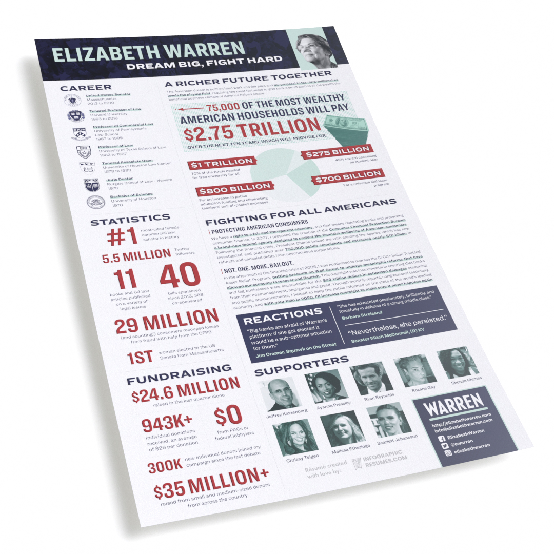
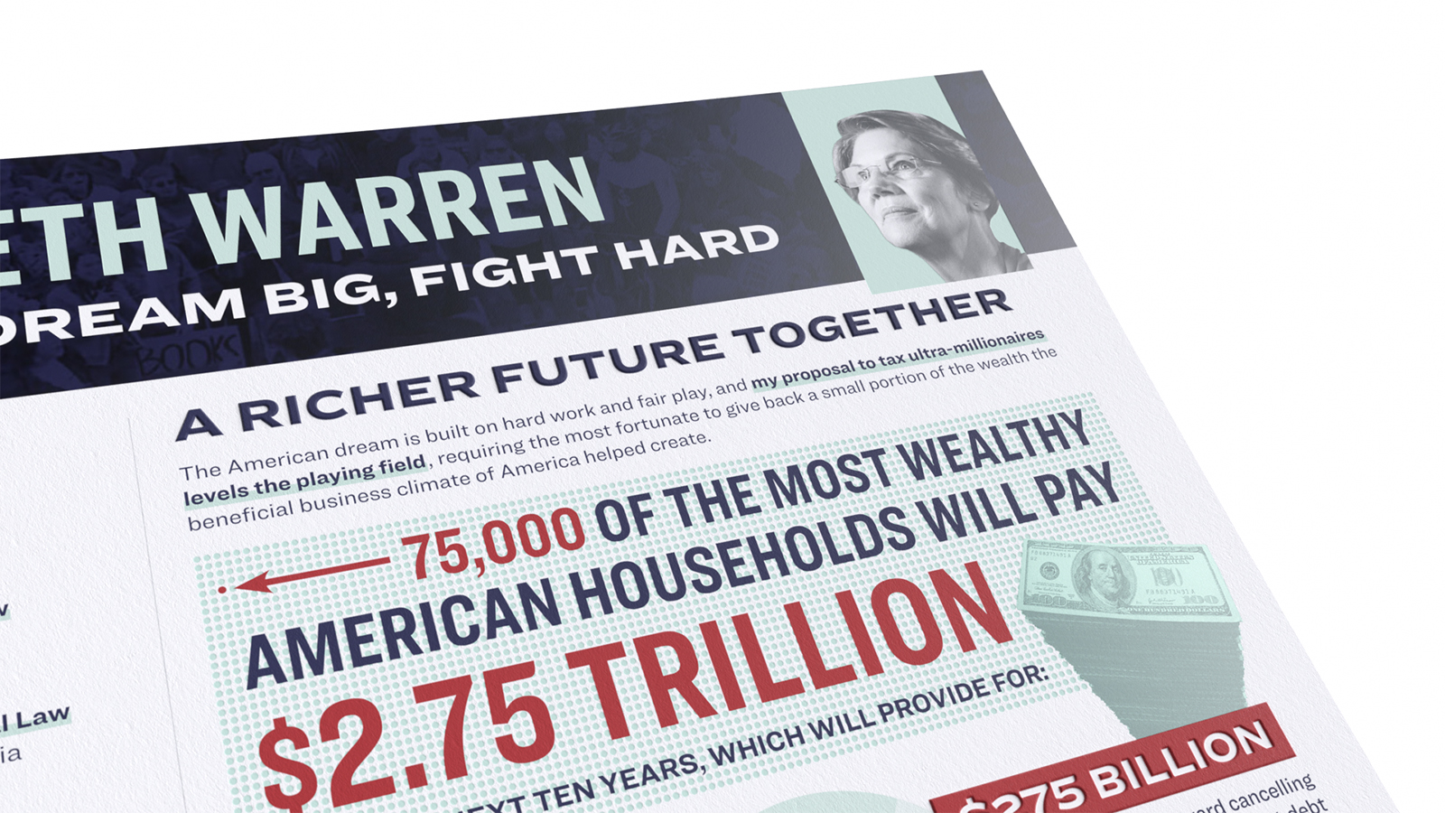
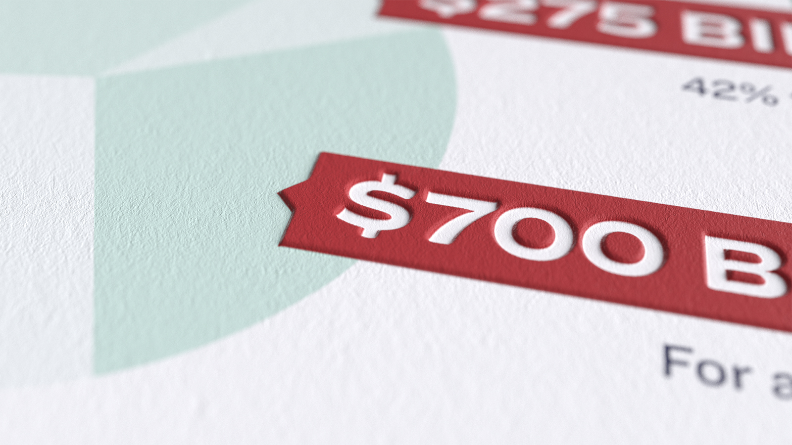
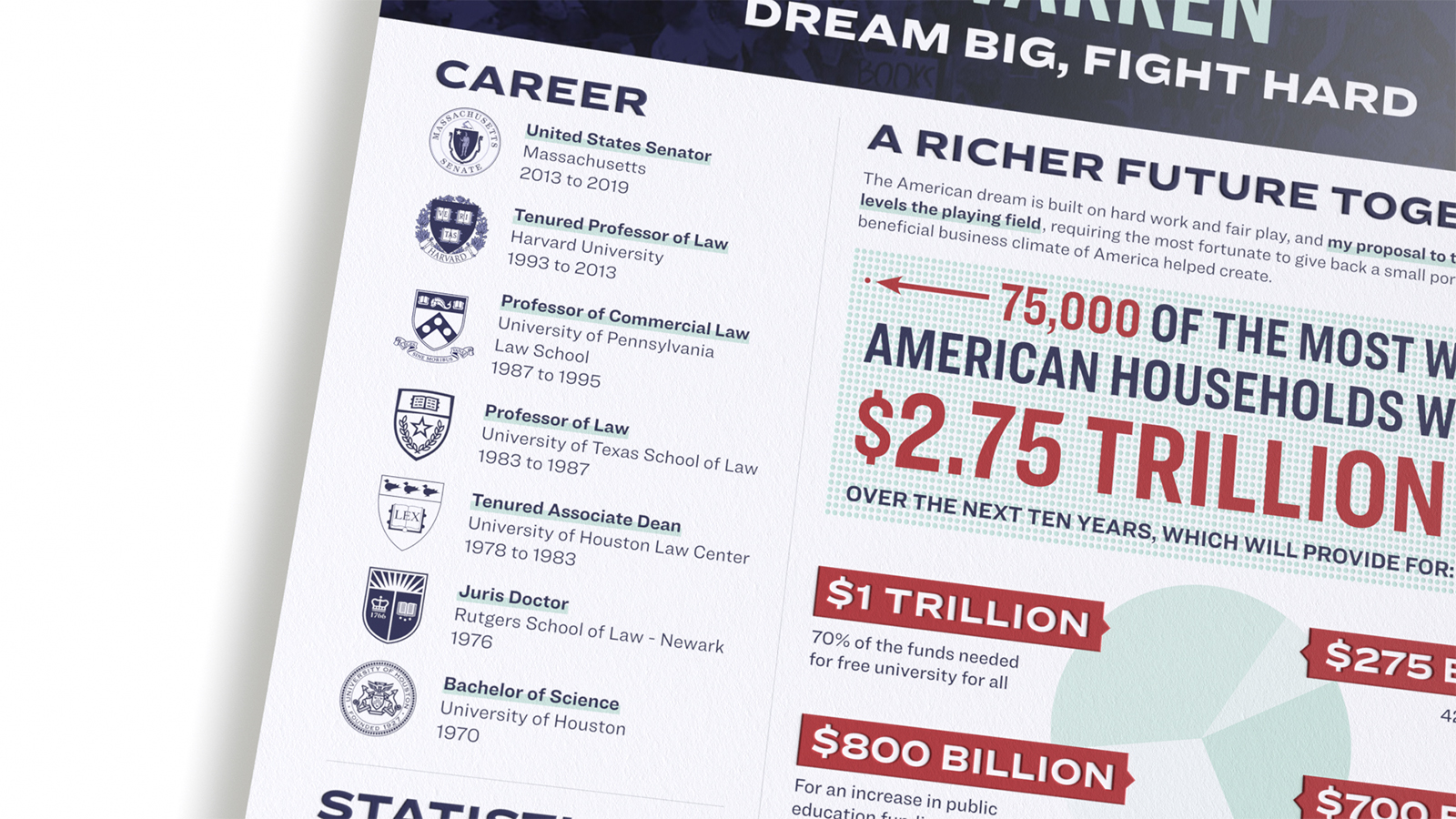
We went to her website and grabbed a few assets to assist us. We use the primary website background for the header and the photo in the top right, both on the ElizabethWarren.com landing page. We found this graph in a Facebook post and used it to inform ours, but spared you a big chunky navy blue-hued pie chart.
On a some sections of the website and social content, the campaign uses a teal box around a navy blue interior.
We repeated that aesthetic in the info section of the résumé.
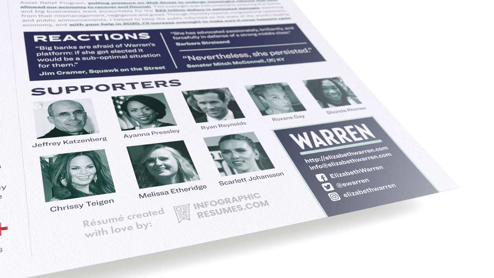
While we’re here, something we found humorous was when someone pointed out that we put Ryan Reynolds and Scarlett Johansson awkwardly close together in Warren’s Supporters section. You’ll have to forgive us for not keeping abreast of the relationship statuses of the glitterati.
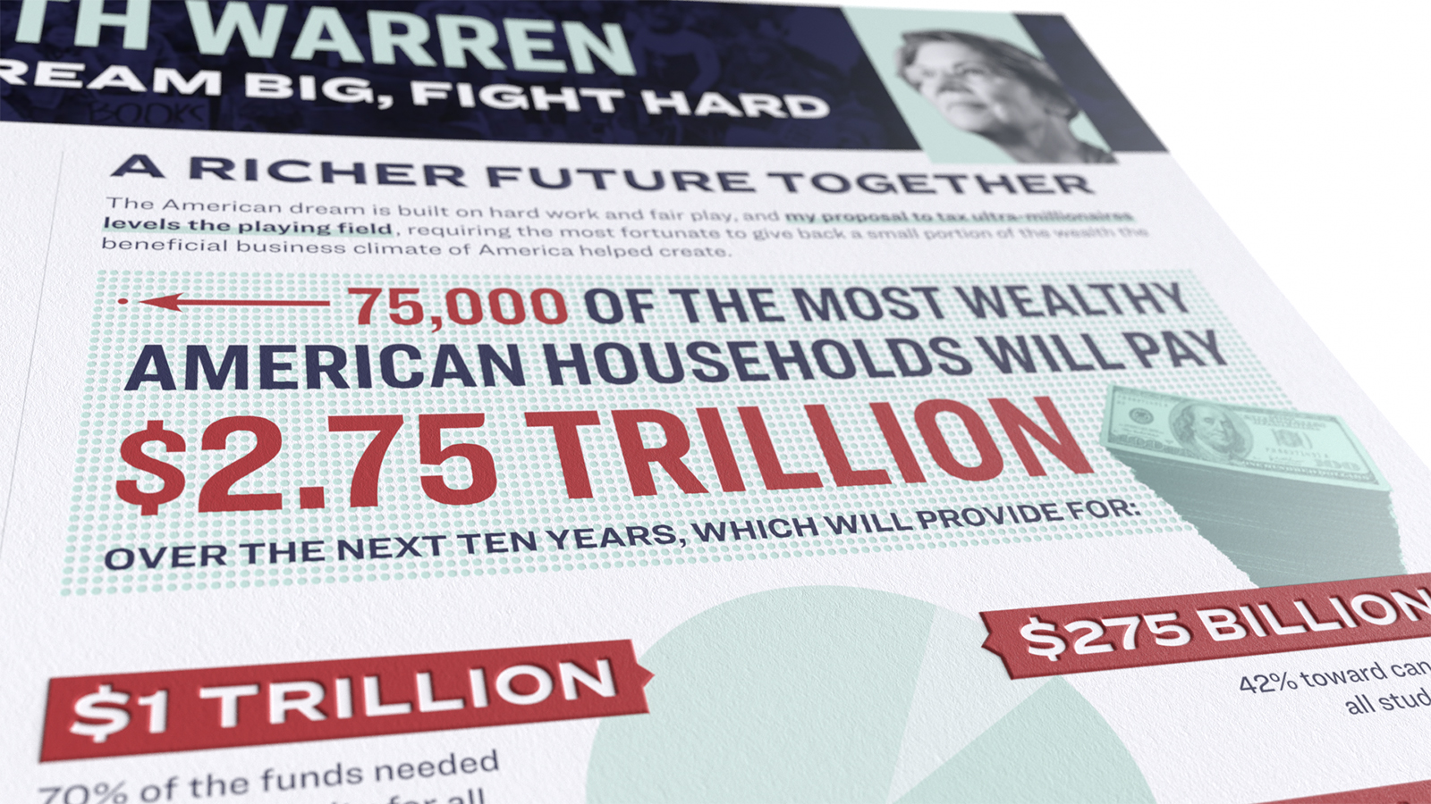
When we design infographics, we focus on big, hairy, audacious numbers and results. No one really knows how a wealth tax would work in the United States, just like if you’re in say, the marketing silo at work, you might not be privy to the information on what your efforts accomplished for the finance side of the business. What we ask our clients for are “defensible” numbers, so when someone asks you in an interview “how’d you do that,” you can explain how you got to that number, just like when Elizabeth is asked about this wealth tax in a debate, she’ll have to give a defensible answer. The reason she published the information is because she’s got one ready.

The campaign has elected to use red sparingly and as a highlight color, but also as a call-out for important figures. Most of the content relies on teal and navy, but they’ve also started using a goldenrod for highlights. We left that out – could have gotten a bit too busy with another color in the mix.
These softer tones (even the red is muted) stand out next to each other but don’t immediately demand attention like the primary red of other campaigns. We can understand why a democratic candidate would want to distance themselves from a primary red. The page uses minimalist and angular shapes, with halftone patterns used to highlight imagery. We couldn’t find a style guide for Warren online, a contrast to other campaigns which openly post theirs in bids to decrease spend by offloading marketing to enthusiastic content creators (like us).
We are conflicted about the campaign’s choice of using Ringside font by Hoefler & Co. It was our most expensive outlay for these three candidate résumés, costing more than all the other fonts combined. We tried using a font that we’ve owned for years (A very similar Hoefler & Co. font called Knockout) but after two iterations, we knew it wasn’t going to be perfect and we pulled the $750 trigger. We think this decision was made by a design team that was hired by the campaign and not by the campaign itself.
In using the Hoefler & Co. fonts, the Warren campaign prices itself out of some would-be support from content creators. Perhaps the campaign’s goal in selecting these fonts was strategy to prevent lookalike/fake news content from popping up. If that was the case, we’re sorry, Liz, but hopefully we’ve done you proud.
We’ve gotta admit, though – it’s a beautiful and versatile typeface. Hoefler & Co. don’t miss.
A final note about our design, we did do something we’re not proud of on Warren’s résumé. One thing we really loved from Warren’s campaign so far was the Billionaire Calculator, and as it is quite controversial, we designed the most interesting section of her résumé to focus on this big idea.
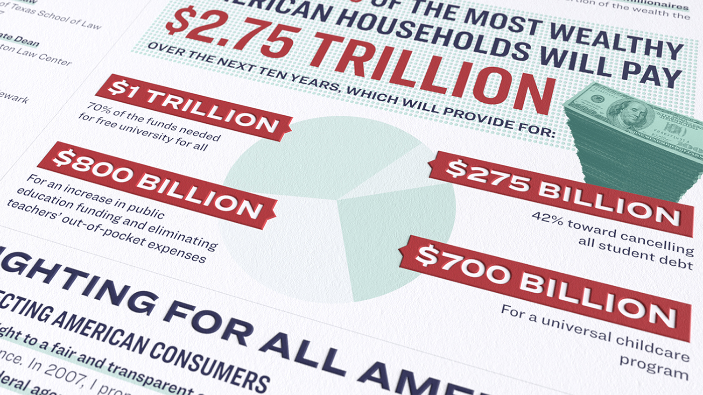
When you get to the last page (where it tells you how much you’re going to owe with the proposed wealth tax), that stack of hundreds beckons the eye. We’re sure it’s stock photography, modified for her website. We did a reverse image search and couldn’t find out who designed it, so we don’t know who to pay. If it’s yours, please reach out and we’ll pay you double. Mea culpa.
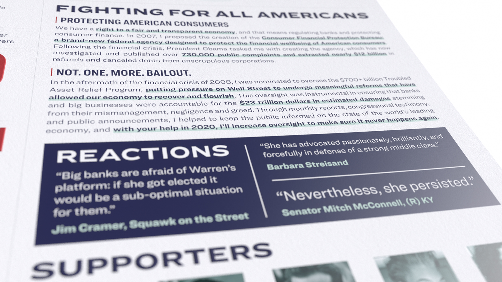
Elizabeth Warren has got that FIGHT. She’s smart, she’s got thorough policy proposals and a consistent track record of helping American people vs. moneyed special interests. We really wanted to include Mitch McConnell’s prophetic quote, “Nevertheless, she persisted,” in this résumé, as it is emblematic of Warren’s heart and the rising tide of strong women taking their rightful places in positions of power.

It was a heck of a lot of fun making Elizabeth Warren’s résumé and we wish her luck in 2020! Go #TeamWarren!
Cheers,

Hagan Blount – CEO, InfographicResumes.com
P.S.: Here is Warren’s résumé without the 3D effect for legibility. We design most résumés on one legal-sized page. Over 80% of the time, résumés are read on mobile first, and legal fits more pleasantly on mobile screens. Try it.