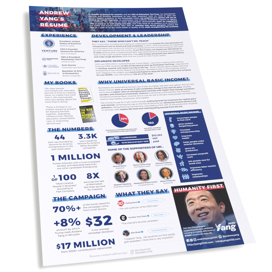
Editor’s note: This is one of three in a series of candidate résumés created by InfographicResumes.com. This post outlines how we made design and content decisions on Andrew Yang’s résumé. We also made résumés for some other progressive candidates (see Elizabeth Warren’s résumé here, see Bernie Sanders’ résumé here).
When we heard about a candidate ushering the concept of universal basic income (UBI) into the national conversation, we were curious.
Whether it’s in the next five years as drivers are automated out of their jobs (drivers are the most common profession in most states), the next ten as lawyers and finance professionals are automated out of theirs, or in the next 25 as everyone from doctors to farm workers to musicians are automated out of theirs, the global force of capitalism sees human labor as an expense to be mitigated. Understanding this part of the game theory behind the global economy will go a long way to solving a problem before it starts.
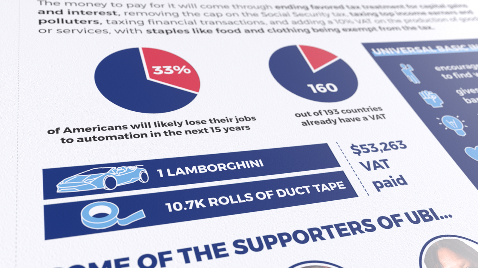
We focused on UBI because it’s his leading policy. “Make Americans Think Harder,” means a lot of things. It means to focus on solving big problems, to question authority, to ask what the future holds and rise to meet it. Yang’s platform addresses a big gap in America’s foreseeable future.
It also addresses the new paradigm of user-generated content driving social activity with a published style guide.
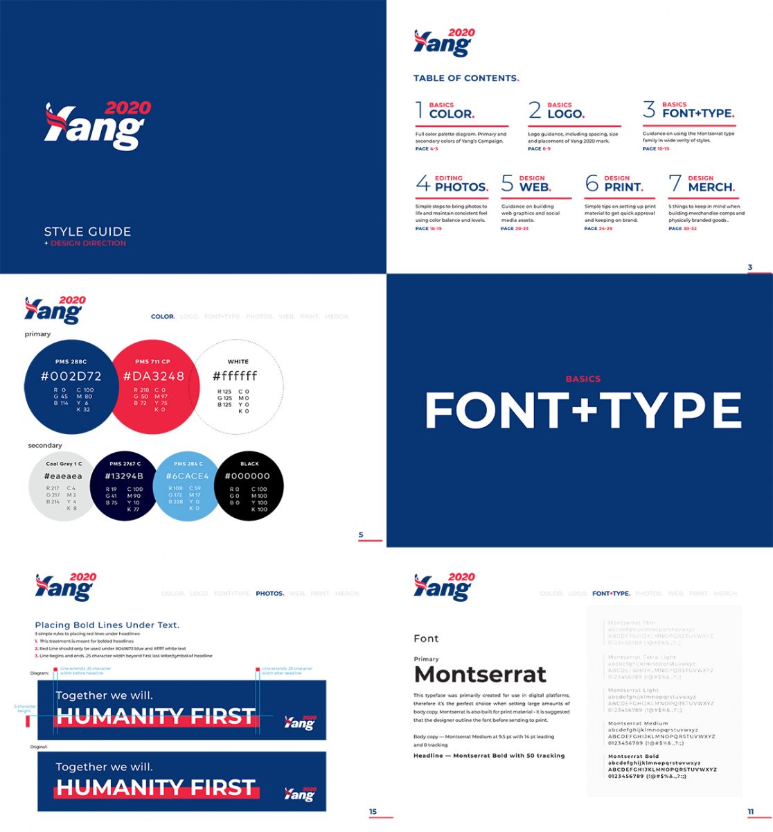
We don’t know why more candidates aren’t doing exactly what he’s doing. He uses different weights of a free font (Montserrat), and while they work just fine together, we could stand for a little more diversity in the style guide. We went directly off of it for his résumé and ignored the Facebook posts that used Alternate Gothic No. 1 (ex. 1, 2, 3) because… we were provided a style guide. That font and Elizabeth Warren’s also happen to be very similar (sure we stretched it a little, but you see it), and we wanted each résumé to have its own character (just like the ones we make for our clients).
We believe that a major factor in choosing Montserrat was because it’s free, and at least part of the decision to add Alternate Gothic No. 1 to the mix was because it’s cheap ($19). If your message is resonating, user-generated content is inevitable. If there’s a set of guidelines and the assets are available for free download and use, the message can be more cohesive. We imagine that future candidates might create and distribute proprietary fonts for their campaigns; that would have been the type (pun intended) of forward-thinking we’d expect from the Yang effort.
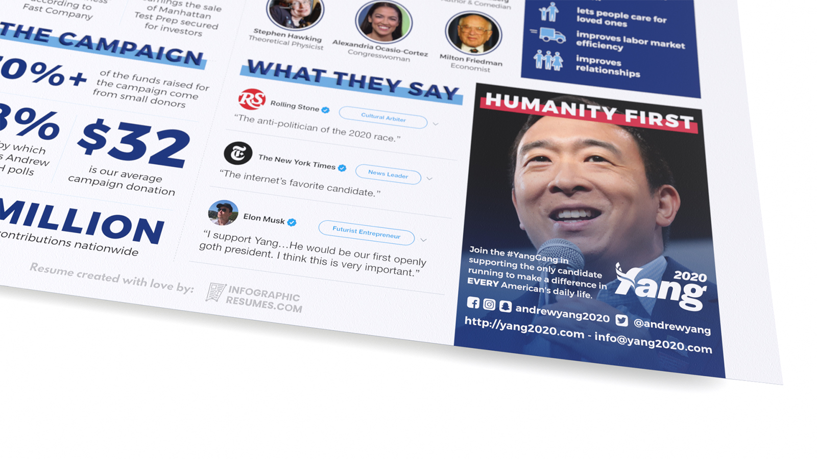
The new font is an improvement, but we think the campaign should update the style guide to include how/where to use the new font. As a brand, it’s important to have a style guide (we make these, too), but it’s more important to keep it up-to-date.
We did look to the Facebook posts for the campaign’s use of iconography (ex. 1, 2). We tend to shy away from lists with icons in our résumés, as they generally don’t reduce the speed at which someone digests salient information. In a typical résumé, you’re only going to get the reader’s attention for 6-30 seconds, so a picture is only worth a thousand words if you don’t have to caption it for someone to get the point. On the other hand, it’s important that a reader is engaged, and in this case, our audience isn’t the pressed-for-time executive we normally target. Color-blocking the area draws readers’ attention and icons add a bit of cheer to this hopeful policy (taken directly from Andrew Yang’s UBI policy page).
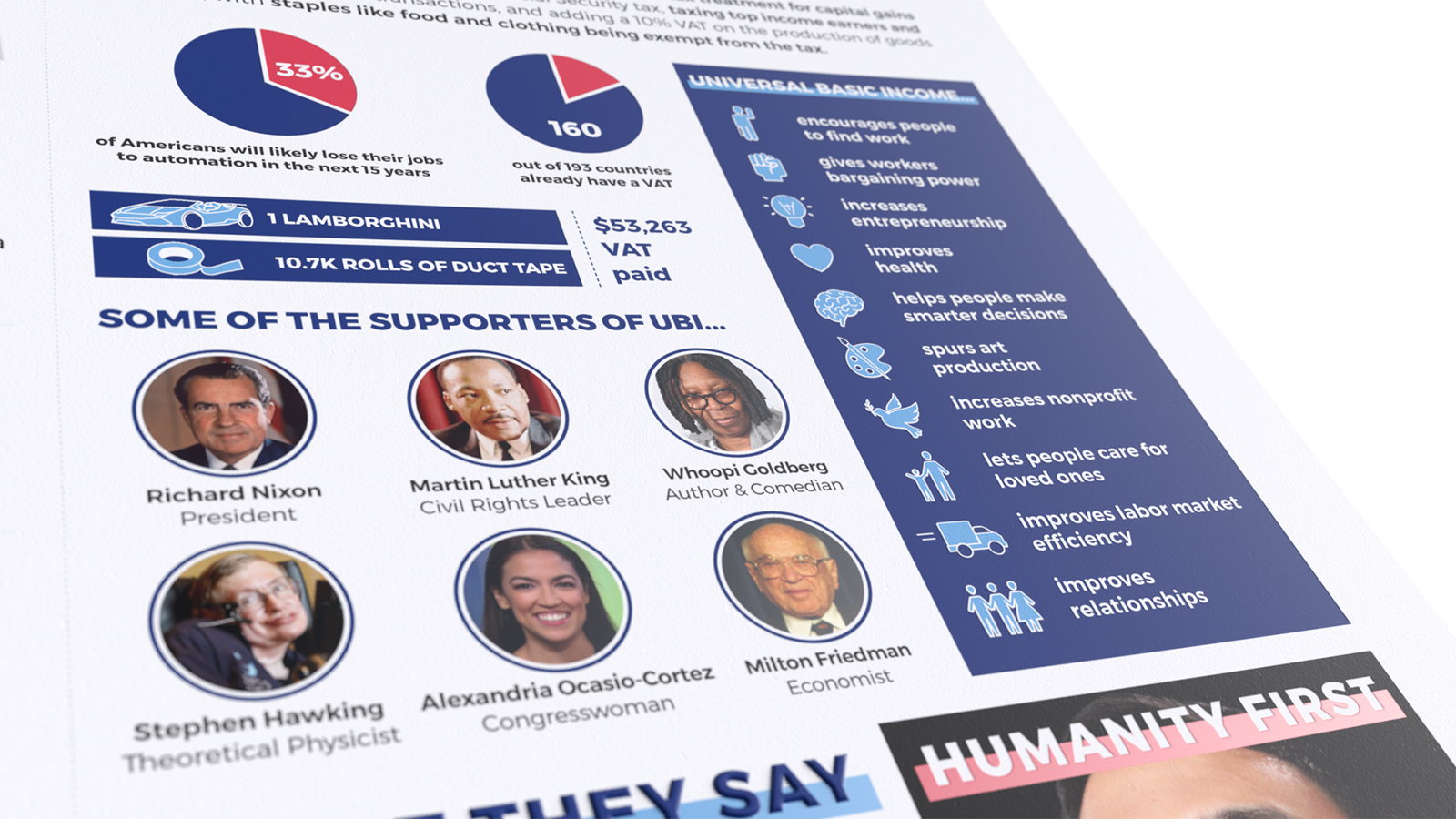
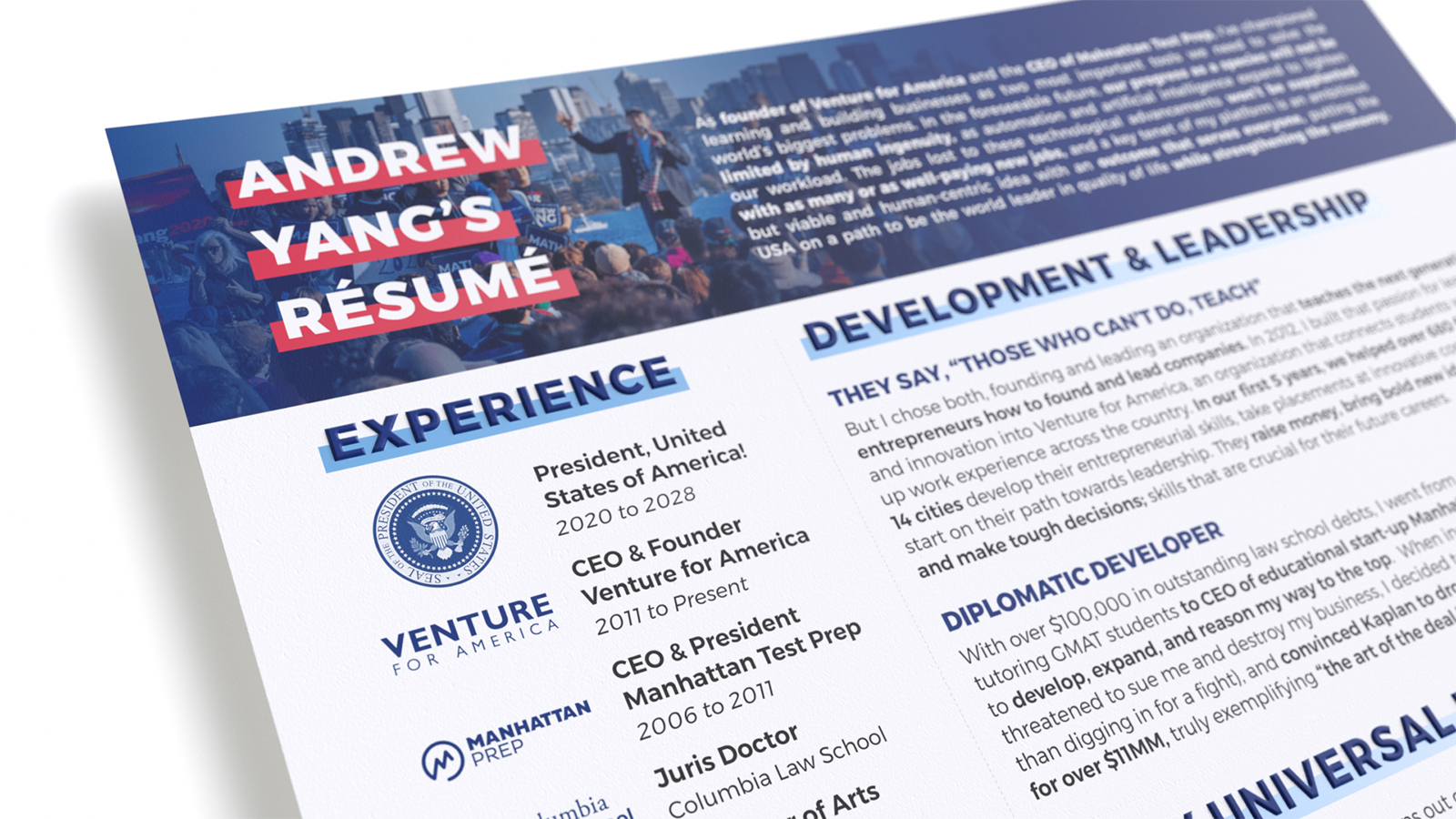
We only had one disagreement with the style guide: the strong red text highlight works well with white text on a dark background, but on a white background, the primary navy blue on red makes it difficult to read. We took a little artistic license and replaced it with the secondary light blue in the headers of the résumé and think it looks a lot cleaner (the customer is not always right).
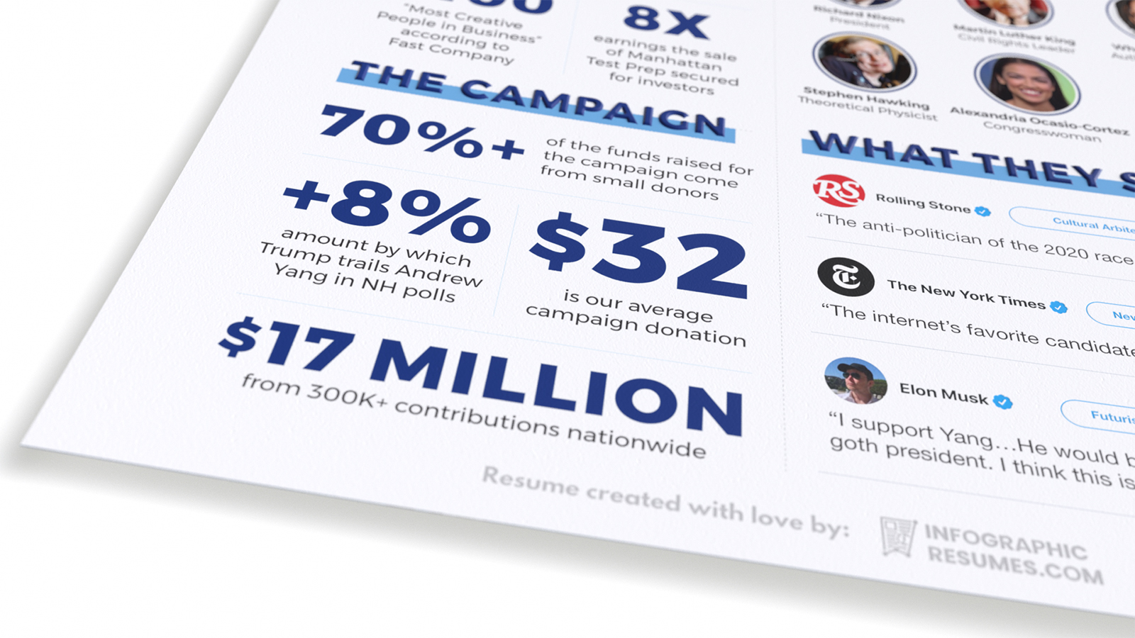
Of the three candidate résumés we did, Yang’s is the only one with no prior political experience. He’s sold a company, been a CEO, a founder, and was named one of the most creative people in business by Fast Company. He’s written two books on policies that can help shape the American success story, focusing on education, jobs, innovation, and the economy. When we design résumés for job-seekers, we don’t just think about what is precisely applicable to their target jobs, but things that are tangentially related, show depth of interest in a subject, and a willingness to think outside-the-box.
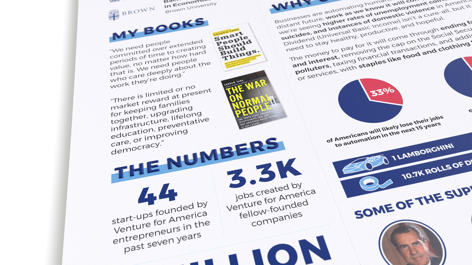
We don’t really think it matters too much as career politician isn’t the only path to the presidency, just like it doesn’t necessarily matter if you were an assistant manager before looking for a managerial role. Long, bulleted bricks of text listing job functions aren’t the best way to show you’ve got what it takes and get the information across in the short window of time your résumé has to make an impression, so we highlight big wins that show problem-solving ability, enthusiasm for the work, and a commitment to excellence.
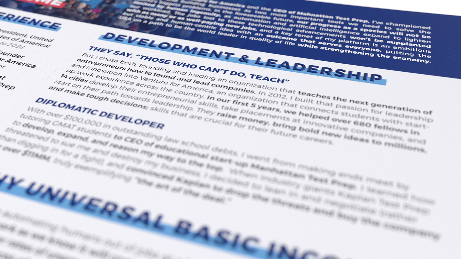
As far as being president goes, you can’t prove you’re any good at it until you’re in the seat, but that’s true for just about any job you’ve never done before, so all you can do is promise to do your best and show that you’re knowledgable on the subject matter.
Good luck in 2020, Andrew! #YangGang!
Cheers,

Hagan Blount – CEO, InfographicResumes.com
P.P.S.: Here’s Yang’s résumé without the 3D effect for legibility. We design most résumés on one legal-sized page. Over 80% of the time, résumés are read on mobile first, and legal fits more pleasantly on mobile screens. Try it.